

What is Mobile Optimization? (Easy Implementation Steps)

Designing a website is like building a house; every detail matters, from the layout to the functionality of each room. Just as a home should be comfortable for everyone, a website must work smoothly on all devices. So, what is mobile optimization? It’s like ensuring your website is a welcoming home, adapting effortlessly to any device, and enhancing the user experience for everyone who visits.
What is Mobile Optimization
Understanding what is mobile optimization and implementing it has become non-negotiable for website success, affecting everything from reach to user satisfaction. It is a critical piece in ensuring a site’s visibility and performance in search engines, especially considering Google’s mobile-first indexing approach.
What is Mobile Optimization?
Mobile optimization is the process of designing and adjusting a website to ensure it functions efficiently on mobile devices. It involves using responsive design to adapt layouts, improving load times, and enhancing navigation for touch interfaces. This ensures a seamless and engaging experience for users accessing the site on smartphones and tablets.
For example, Etsy’s platform is optimized to provide a seamless shopping experience on both desktop and mobile devices, ensuring it works smoothly on smartphones and tablets alike.
Elements of Mobile Optimization
When it comes to building a mobile-optimized website, there are a few key ingredients that make all the difference in creating a smooth and engaging experience for users. Let’s take a look at what makes mobile optimization work:
- Responsive Design: Ensures the website layout adapts to various screen sizes and orientations.
- Fast Load Times: Optimizes images and uses efficient coding to reduce loading delays.
- Simple Navigation: Provides easy-to-use menus and buttons suitable for touch interfaces.
- Readable Text: Uses fonts and sizes that are legible on smaller screens without zooming.
- Mobile-Friendly Forms: Designs forms that are easy to fill out on mobile devices.
- Touch-Friendly Elements: Ensures buttons and links are large enough to be tapped easily.
- Optimized Media: Uses videos and images that load quickly and play smoothly on mobile devices.
- SEO Optimization: Implements mobile-specific SEO strategies to improve search visibility.

Why Is Mobile Optimization Important?
Mobile optimization is key to reaching and engaging your audience effectively. Here’s why it’s so important:
- Increased Mobile Traffic: With most internet users accessing sites via mobile devices, optimization ensures they have a seamless experience.
- Enhanced User Experience (UX): Focusing on UX optimization by making your site mobile-friendly enhances accessibility and ensures a more enjoyable experience for users.
- Broad Audience Reach: You cater to more than half of your potential audience without negatively impacting desktop users.
- Benefits:
- Higher engagement and conversion rates
- Reduced bounce and cart abandonment rates
- More frequent return visits
- Competitive advantage in the market
Check out our detailed blog post to learn about conversion rate optimization in SEO.
Implementation of mobile optimization
Getting your website ready for mobile users is an important process. In the sections ahead, we’ll get into practical steps and techniques to make sure your site is adaptable on every device.
1. Use a Responsive Web Design
Responsive design is essential for understanding what is mobile optimization. It’s about ensuring your website looks and functions beautifully on any device, whether it’s a massive desktop monitor or a tiny smartphone screen. By implementing flexible grids and layouts, your site automatically adjusts to fit the screen size and orientation.
For example, a three-column layout on a desktop might seamlessly transform into a single-column layout on a mobile device, ensuring content is easy to read and navigate. This adaptability provides users with a consistent and enjoyable experience, no matter how they access your site.

2. Optimize Load Times
Optimizing load times is essential for maintaining user engagement, especially on mobile devices where speed is crucial. A slow-loading site can frustrate users and lead to high bounce rates. To ensure your site loads quickly, focus on compressing images to reduce file sizes without sacrificing quality. Implement browser caching to store frequently accessed data locally, speeding up subsequent visits. Minimize code by removing unnecessary scripts and styles, streamlining your site’s performance.
Steps and Tips:
- Compress Images: Use tools like TinyPNG or ImageOptim to reduce image sizes while maintaining quality.
- Leverage Browser Caching: Set up caching rules to store static resources locally, improving load times for repeat visits.
- Minimize Code: Clean up your HTML, CSS, and JavaScript by removing redundant code and using minification techniques.
- Use Content Delivery Networks (CDNs): Distribute your site’s content across multiple servers globally to reduce latency.
- Optimize Server Response Time: Choose a reliable hosting provider and regularly monitor server performance to ensure quick response times.
3. Simplify Navigation
Simplifying navigation is crucial for mobile users to find what they need quickly and easily. Understanding what is mobile optimization involves recognizing that on smaller screens, cluttered menus can be overwhelming. It’s important to keep things clear and straightforward. Use concise, well-organized menus and ensure buttons are large enough for easy tapping, making the browsing experience intuitive and user-friendly.
Steps and Tips:
- Use a Hamburger Menu: For complex sites, a collapsible menu can save space and keep navigation tidy.
- Prioritize Key Links: Highlight the most important links and features to guide users efficiently.
- Ensure Touch-Friendly Elements: Design buttons and links to be large and spaced out, preventing accidental taps.
- Implement Search Functionality: Include a search bar for users to quickly find specific content or products.
- Test on Multiple Devices: Regularly check your navigation on various mobile devices to ensure consistency and ease of use

4. Use Legible Fonts
Making sure your text is easy to read on mobile devices is super important. You want your users to enjoy browsing without squinting or zooming in. Choose fonts that are clear and set a minimum font size so everything looks great on small screens.
Steps and Tips:
- Pick Friendly Fonts: Go for simple, easy-to-read fonts like Arial or Helvetica that don’t strain the eyes.
- Keep Text Big Enough: Aim for at least 16px for body text so everyone can read without zooming.
- Space Things Out: Use enough line spacing to keep your text neat and easy to follow.
- Use Good Contrast: Make sure your text stands out against the background for easy reading.
- Check on Different Devices: Test your fonts on a variety of screens to ensure they’re always looking sharp.
Browse Google Fonts, and find out what works for you!
5. Mobile-Friendly Forms
Filling out forms on a phone should be a breeze, not a chore. You want it to be quick and easy for users. Make fields big enough to tap, use auto-fill to save time, and only ask for the essentials to keep things simple.
Steps and Tips:
- Go Big on Fields: Make sure input boxes are large enough to tap without fuss.
- Auto-Fill Magic: Let users fill in details faster with auto-fill options.
- Keep It Simple: Only ask for what you really need; less is more.
- Clear Labels: Use straightforward labels so users know exactly what to enter.
- Try It Out: Test your forms on different phones to make sure they’re user-friendly everywhere.

If you feel that you are not able to understand what is mobile optimization, or just having issues to implement it on your website, don’t hesitate to reach out to us as we provide web design services with mobile optimized layouts.
Need a Digital Solution?
Get in contact now with Experts!
We answer calls 24/7!
6. Optimize Media Content
Optimizing media content is a key aspect of understanding what is mobile optimization. Getting your images and videos look great on mobile devices is essential. You want them to load quickly while maintaining sharpness. Use the right formats and sizes to keep media snappy and high-quality without slowing down your site’s speed.
Steps and Tips:
- Choose the Right Formats: Use formats like WEBP for images and MP4 for videos to balance quality and size.
- Resize Media: Adjust the size of images and videos to fit mobile screens without overloading them.
- Compress Files: Use tools to compress media files, keeping them lightweight while maintaining quality.
- Lazy Load: Implement lazy loading so media only loads when it’s about to be viewed.
7. Accelerated Mobile Pages (AMP)
Accelerated Mobile Pages (AMP) are all about speed. They help your site load lightning-fast on mobile devices, giving users a smooth and quick browsing experience.
Steps and Tips:
- Implement AMP HTML: Use AMP-specific HTML tags to streamline your pages for faster loading.
- Optimize CSS and JavaScript: Keep CSS minimal and use AMP-approved JavaScript to enhance speed.
- Use AMP Caching: Take advantage of AMP’s caching to serve your pages quickly from Google’s servers.
- Monitor Performance: Regularly check your AMP pages to ensure they’re loading as fast as possible.
- Validate AMP Pages: Use AMP validation tools to ensure your pages meet all AMP requirements for optimal performance.
8. Work on Core Web Vitals
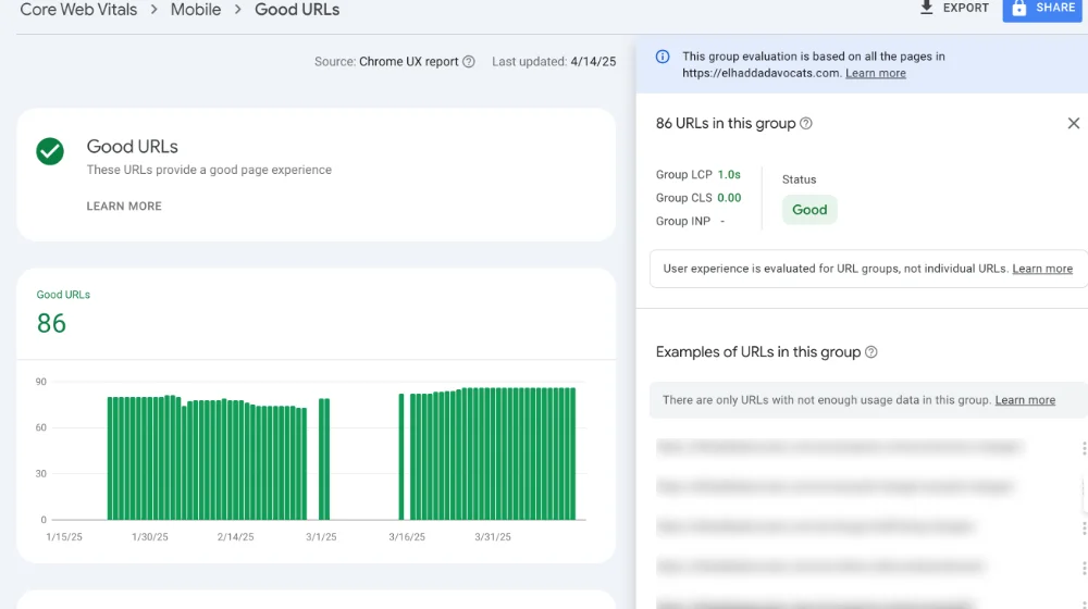
Core Web Vitals are essential metrics used by Google to evaluate the user experience on a webpage. They focus on loading performance, interactivity, and visual stability, which are crucial for keeping users engaged and satisfied.
Key Metrics Explained
- Largest Contentful Paint (LCP): Measures how long it takes for the main content of a page to load. Faster LCP ensures users can quickly access the primary content, reducing the chance of them leaving the site.
- Cumulative Layout Shift (CLS): Measures the visual stability of a page by tracking how much the layout shifts during loading. Minimizing shifts prevents user frustration from accidental clicks and enhances the browsing experience.
- Interaction to Next Paint (INP): Measures the time it takes for a page to respond after a user interaction, such as a button click. Quick responses ensure users can interact smoothly without delays, maintaining engagement.
| Metric | Good | Needs Improvement | Poor |
|---|---|---|---|
| Largest Contentful Paint (LCP) | ≤ 2.5 seconds | 2.6 to 4.0 seconds | > 4.0 seconds |
| Cumulative Layout Shift (CLS) | ≤ 0.1 | 0.1 to 0.25 | > 0.25 |
| Interaction to Next Paint (INP) | ≤ 200 milliseconds | 200 to 500 milliseconds | > 500 milliseconds |
9. Dynamic Serving
When resources for a complete site redesign are limited, dynamic serving offers a practical solution. By using a single URL, you can deliver tailored HTML and CSS based on the visitor’s device. This technique, known as user agent detection, helps customize the experience for different users. For example, a news website might show mobile users a simplified layout for easier reading on smaller screens.
How It Works
Dynamic serving leverages the Vary HTTP header to adjust content based on the device. Here’s a simplified explanation:
- Request: The server identifies the user agent when a page is requested.
- Response: Content is served that matches the device type, enhancing usability.
10. Analyze Behavior With an Analytics Tool
Think of behavior analytics tools as your website’s secret agents, uncovering where users face challenges and where they navigate easily. These tools capture user actions like clicks and scrolls, offering insights through heatmaps and session recordings. Before you make any design changes, it’s crucial to understand how visitors interact with your site, especially around important buttons and forms.
For instance, a heatmap can reveal which areas of a mobile site get the most attention, helping you pinpoint where improvements are needed. By analyzing these friction points, you can make thoughtful adjustments to enhance the overall user experience.
Recommended Tools
- Hotjar: Provides heatmaps and session recordings to visualize user behavior.
- Google Analytics: Offers insights into user flow and drop-off rates.
- Crazy Egg: Delivers click tracking and scroll maps to pinpoint areas of concern.
11. Opt for Security and Privacy
Ensuring security and privacy is crucial when learning what is mobile optimization. Users need to trust that their data is protected, especially when interacting on mobile devices. Here’s how you can improve security and privacy:
How to Optimize Security and Privacy:
12. Optimize Content for Mobile Users
When it comes to mobile, the goal is to make things as easy as possible for your users. Start by putting the important stuff, like your products or services, right at the top. This way, people can find what they’re looking for without having to dig around. Adding a quick table of contents can also help guide them through your content smoothly.
Think about readability, too. Break up those long paragraphs into shorter ones, and use bullet points and headings to make things clear. A clean design with readable fonts and plenty of space makes browsing more pleasant. Plus, a simple heading structure can really help users find their way around.
Don’t forget about titles and meta descriptions! Keep them short and make sure users and search engines know exactly what your page is about.
As you are creating content, keep in mind to create content based on strategies that works. Check out our detailed blog post to learn more about how to create effective SEO strategies.
Frequently Asked Questions
Mobile optimization is essential for enhancing online visibility and providing a user-friendly experience across devices. These FAQs address crucial aspects of leveraging mobile optimization for web and app development.
Why is mobile optimization important for online presence?
Mobile optimization is critical as more users access the internet via smartphones and tablets. An optimized mobile presence helps in retaining user attention and improving the overall accessibility of a website.
How does optimizing a website for mobile devices improve user experience?
Optimizing a website for mobile devices ensures that content is easily readable and navigable on smaller screens, reducing load times and accommodating touch-based navigation.
What are some effective strategies for optimizing mobile applications?
Strategies for optimizing mobile applications include simplifying interfaces for touch interaction and ensuring applications are responsive across different mobile platforms and devices.
In what ways does mobile optimization impact search engine rankings?
Search engines favor mobile-friendly websites, often ranking them higher in search results. This leads to better visibility and potentially more traffic.
How can website owners conduct mobile optimization tests effectively?
Website owners can use tools like Google’s Mobile-Friendly Test to assess how well their site performs on mobile devices and identify areas that need improvement.
What considerations should be made when optimizing CSS specifically for mobile performance?
When optimizing CSS for mobile performance, it is important to prioritize responsive design, utilize media queries to apply device-appropriate styling, and minimize the use of large images that can slow page loading times.
Conclusion
Understanding what is mobile optimization is crucial for any business looking to thrive in the digital age. It not only enhances user experience and engagement on mobile devices but also plays a significant role in improving a site’s SEO performance. As we embrace a mobile-first world, mastering what is mobile optimization becomes essential for staying competitive and meeting the evolving expectations of users.
Need a Digital Solution?
Get in contact now with Experts!
We answer calls 24/7!


